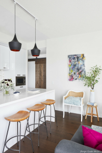
Designer Linda Mazur transforms this kitchen space into something more functional that opens up to the main living area, creating uninterrupted fluidity for this rustic modern home on the Carpet One blog.
As our eyes gaze down the length of this galley-like kitchen, we instantly fall in love with the beautiful sliding barn door – a trend seen in so many interiors today. What insight can you provide on incorporating this element into a home?
As a designer, I love the element of texture added to space, and in this case in particular, the barn door stands in complete contrast to the stark white-gloss finish of the adjacent kitchen. This doorway leads to the master bed/bath and was the perfect location to introduce this feature to create a focal point and elevate an otherwise plain long wall. This type of feature can be created with many different styles of doors, should the rustic barn door not be complementary to your décor aesthetic.

Despite its expansive look and feel, at its bones, this kitchen totes a relatively small footprint. How did you overcome this aspect through design?
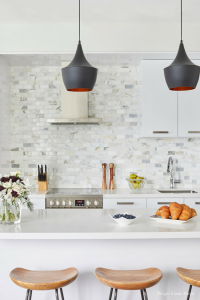
The kitchen is a relatively small footprint for sure. The space was designed to maintain uniformity and symmetry by balancing the pantry and fridge (which are hidden with matching cabinetry) at either end of the entrance to the kitchen space; and adding the beautiful marble tile backsplash to complement the cabinetry. The larger island afforded us extra, well-utilized storage space and a great work surface, as well as seating space. It’s a very white-on-white space, with just a pop of color to the backsplash, allowing us to integrate the kitchen space easily in to the main living area. The absence of color in this case, and using a flat panel door front, has sort of blended the kitchen cabinetry in with the walls to create an uninterrupted sense of fluidity to the space.
The flooring offers such great contrast. Can you tell us about the type and style?
What makes it work within this space? The flooring is a 5 ½” wide plank, slightly aged-looking, engineered laminate. The color is lovely: a calm and warm brown tone that works well with the décor, but is not so dark that it overwhelms the space. This condo has an abundant amount of natural light, which brings out the warm tones of the flooring beautifully; and the wider width is great for smaller spaces – as it minimizes the busyness of narrower-width flooring.

The seating truly stands out in this space. What are your top priorities when choosing counter stools and/or additional seating for a kitchen?
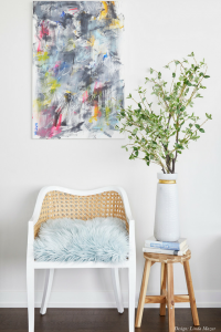
Counter stools really need to fit the space….as you can see these are very tailored in their size so they do not overwhelm the “common area” or through-way as you pass by. We also wanted to highlight wood tones and black accents throughout the area, so these were the perfect fit! The same goes for the additional seating that was added in. I love the play on texture and complementing the wood tones with the caning in this chair, however, the soft curves stand in direct contrast to the hard corners of the kitchen – and the cushion adds a bit of color and whimsy to the home.
The island’s minimalist lines and clean, white-on-white coloring is such a lovely combination. What was the goal for this element?
My clients purchased a lovely corner unit with an abundant amount of windows and natural light. Their last condo was a bit more constricted so this time we really wanted to maintain the “airy” feeling of the space. We used a lot of white-on-white coloring throughout the space, which can some times appear cold or clinical. In this case, we used the wood tones to create warmth and texture, as well as soft shades of greys and blues to create calmness.
How did the expansive backsplash come to life?
We notice the tones incorporated compliment the exposed concrete beams within the space. The backsplash is lovely, isn’t it! We wanted to create a feature wall in the kitchen as it is in direct view of the rest of the living space, and this beautiful marble tile was just the thing. It added a bit of warmth and organic feel to the plain, white cabinetry. We also selected it to complement both the exposed concrete, as you noted, as well as the surrounding furnishings within the main living space.
Let’s talk lighting. We’re seeing more and more matte black used in interiors, and it seems to be particularly prevalent in kitchen design. What makes this finish so well-suited to this space?
Black is a great addition to any space, and a hint of black will anchor any design. Though matte black is extremely trendy at the moment, black truly never goes out of fashion. In this particular instance, we used the matte black to punctuate the calmness of the space. The matte vs gloss finish is most complementary to other textures within the common area, such as the concrete and the wood tones. Using a more gloss finish, in this case, would appear jarring and out of place.

We love a space that serves multiple purposes – and this dining area appears to do just that. Do you have any go-to rules when it comes to shelving?
In this case, this little area was designed to make use of a small alcove as well as to provide much needed storage for my clients. It’s a great addition to their home and perfect for entertaining! One important thing to remember: small spaces can appear even smaller when cluttered, so when you are designing or living with open shelving in your “small space” home, remember to declutter and to arrange your shelving accordingly.
Please Join Our FREE Newsletter!


