
Designers agree on one thing—color is one of the powerful elements in design. It can make or break a room. The advertising industry, out of necessity has championed the topic and perusing any number of articles on the subject helps add a bit of science behind the selection process. Remarkably 90% of an assessment for trying out a product is made by color alone. Imagine how that notion is translated into interior design.
These tips on the science of color and how it can affect your room comes from McCalls Carpet One.
Understanding the effects by color
Red (warm)– Has a physical effect, raising blood pressure and respiration rates.
Enhances human metabolism which is why we often see it used in dining spaces.
Brighter: more energetic Darker shades: powerful and elegant.
Orange (warm)– Vibrant and energetic, friendly, inviting
Muted forms, are associated with the earth and with autumn.
Association with changing seasons: can represent change and movement in general.
Associated with the fruit: health and vitality.
Yellow (warm)– Brightest, most energizing of the warm colors.
Bright yellow: sense of happiness and cheerfulness.
Light yellows: more calm feeling of happiness than bright yellows.
Dark & gold-hued: can look antique, have sense of permanence.
Blue (cool) – Light: relaxed and calming.
Bright: energizing and refreshing.
Dark: strength and reliability
Green (cool) – Easiest color for the eye to look at. Has a balancing, harmonizing effect.
Brighter: energizing, vibrant
Dark: most stable representative of affluence.
Purple (cool) – Associated with royalty, creativity & imagination.
Attributes of both red and blue.
Dark: sense wealth and luxury.
Light: softer associated with spring and romance.
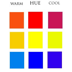
Undertones and Mass Tones
What you see at first glance is the color’s mass tone, but what is less obvious is the color’s undertone. Use undertone to skillfully emphasize or downplay elements within a home. For example a beige with a red undertone will create a harmonious palette when used with other warm and red tones, but will highlight those with cool undertones like greens and blues when used together. In the picture here, mass tone are in the middle – undertones on the two sides.
 Palette Messaging
Historic and Neutral Palettes
Muted, rich, and muddied tones.
Depth and strength that speak to permanence.
Association with a history of success.
Offer a feeling of trust and comfort in consistency.
White and Grey
Clean white or grey palettes feel orderly.
Very peaceful like that of an art gallery.
Nothing can be concealed and the space must be used efficiently to maintain and guest will relate to that message.
Pop of Color
In motion, change and evolve: reinforce with use of current colors.
Obvious color applications apply a definitive date stamp.
Youth gravitate toward the most current of everything, color is a powerful way to demonstrate that.


